
Build the questionnaire · Administrator
Style the survey and check accessibility
Apply readable branding and verify that participants can navigate, answer, and save on their devices.
Screenshots from the original Surveylet guide illustrate the controls below. Layouts and labels may vary with your survey configuration. Select an image or “View full size” to open it in a new tab.
Branding and layout
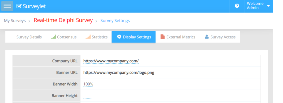
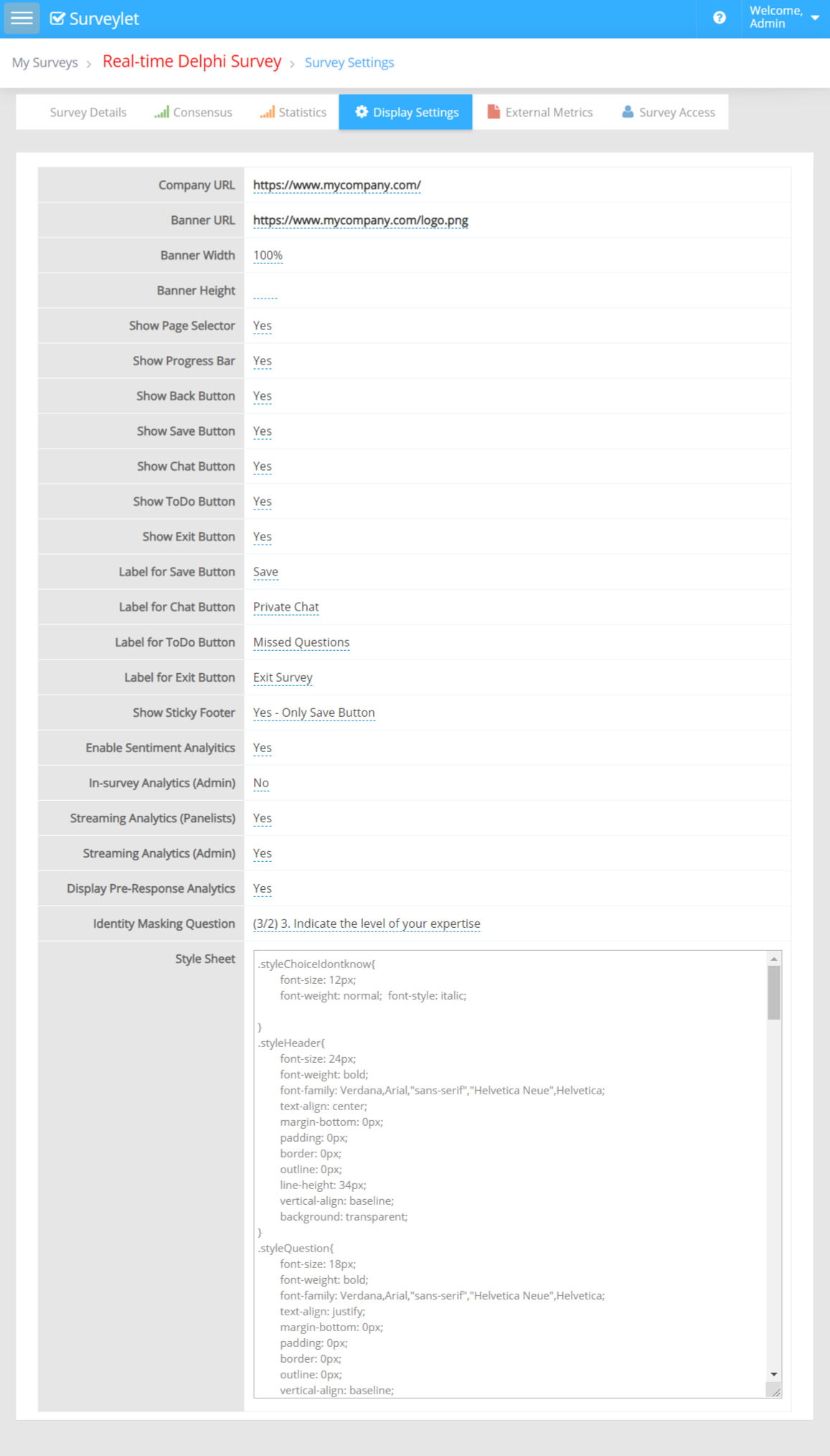
Where Survey Branding is enabled, set the banner image and organization link in Survey Settings → Display Settings. Use a web-accessible image such as PNG or JPEG. A PDF is not a banner image. Combine multiple logos into one image when needed.
Use a size that fits small screens. Setting only one image dimension helps preserve the aspect ratio. Account login branding is configured separately in Account Settings.
More screenshots and examples (1)
Use the survey style sheet
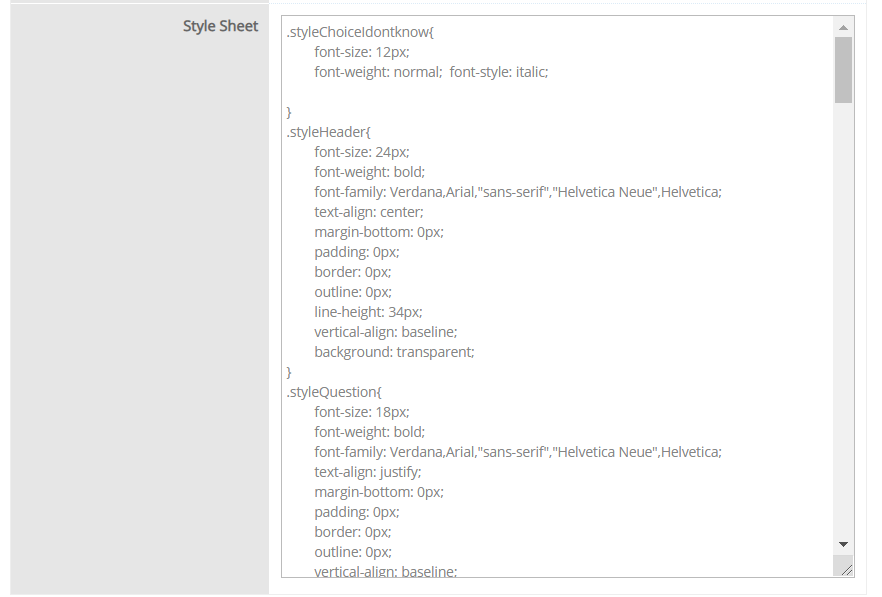
The survey Style Sheet applies shared styles to elements such as questions, choices, and matrix labels. The following documented selectors are useful starting points:
| Selector | Element |
|---|---|
.styleQuestion | Question title. |
.styleQuestionDetails | Question details. |
.lbl | Standard choice labels. |
.styleMatrixRowTitle | Matrix row labels. |
.styleMatrixColumnTitle | Matrix column labels. |
.styleMatrixColumnChoiceTitle | Matrix choice labels. |
For example, a readable size for standard choice labels can be set with:
.lbl { font-size: 18px; line-height: 1.5; }Test selectors against the current survey theme. A large inherited style sheet or custom script can affect layout and keyboard behavior. Keep a copy of the original before changing it.
Check the participant experience
- Use Tab, Shift+Tab, arrow keys, Space, and Enter to navigate and operate the controls appropriate to each input type.
- Make focus visible and ensure popup help can be opened and closed.
- Check text and contrast at increased browser zoom.
- Check Save, Next, and the footer on a narrow screen.
- Provide meaningful labels and alternative descriptions for information shown in images.
- Check matrix readability and required-field messages.
For formal accessibility documentation or help resolving an observed issue, contact Calibrum. A styled survey should still be tested with the content and controls used by your particular study.